 Selecting a color that not only represents you, but also represents your brand is no easy feat. The color must be a representation of both you and the brand in one simple glance; like your own personal championing mascot – because first and more importantly lasting impressions make all the difference.
So when it came time to choose the “Artful Matters” trademark color, I ensured it would show both my charismatic personality and exude professionalism that of the Artful Matters brand. If you have ever seen me about town, you understand I have a deep routed love for the richness of purple and usually shroud myself in one or two purple tones on any given day.

Artful Day!
How did I become so addicted to purple? It is hard to identify exactly how or when the obsession started. However, I know that it has been a progressive craving that began when I was a child. I remember having a treasured purple hoody that I paired with my cowboy boots – Don’t judge! I liked the clickety clack sound the heels made – obviously I had way too much fashion sense for a boy in Kansas. This led me down a road paved in purple, not yellow, and has now become “my signature color” – (I say this with my best Shelby accent).
Even as big as my love is for purple, there were other factors that played into the overall decision to select it as my Artful Matters brand color. Not only does purple take me back to my stylish childhood, but it also reminds me of the most monumental day in my life – the day I wed my husband; it was the color of choice for our beloved wedding. Those factors alone were enough to convince to opt for this enriched color. However, when I dug deeper into the history and meaning behind purple, it was like seeing a magical purple aura surround the words Artful Matters, it was then I knew I MUST use this color.
You see, purple has such a rich history once reserved only for that of royalty, clergy and the upper echelon of society – hence the phrase “born in the purple.” So what better color to represent the history and significance of proper protocol than purple?

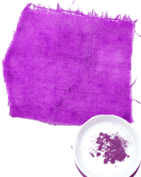
The word purple is derived from the Latin word purpura – taken from that of the Tyrian purple dye. Named so because of the dye produced and traded in Tyre, modern day Lebanon, as far back as 15th Century BC. These purple producers were extracting the mucus secreted by a sea snail, called spiny dye-murex to dye wool, linen and silks into rich and lustrous fabrics – bet you never look at purple the same way again!
The process of making the dye was long, tedious and very expensive! So expensive was this color to produce that some Roman emperors outlawed, punishable by DEATH, the general public from wearing purple – giving a new meaning to “death by fashion.”
The snail shells were cracked open, soaked in water, the small gland was removed and placed in the sun to bake. The sunlight would work its magic, turning this gland/mucus from white to yellow, green, then violet and finally all the way to dark red – to the point of resembling dried red blood. There was a precise craft to knowing exactly when to stop the process to achieve the perfect purple hue for manufacturing cloths. It could take thousands of these slippery little suckers – another Julia reference – to yield one ounce of usable dye. It was a simple supply and demand market that kept owning purple-dyed garments reserved only for the rich; that was until the 1850’s when a synthetic dye enabled mass production. Now everyone can enjoy the purple passion craze.
It is easy to see how purple conjures up the idea of mystery, magic, spirituality, creativity, piety, wealth and royalty. Knowing all of this, the choice was simple – I am purple and purple is Artful Matters!


Leave A Comment